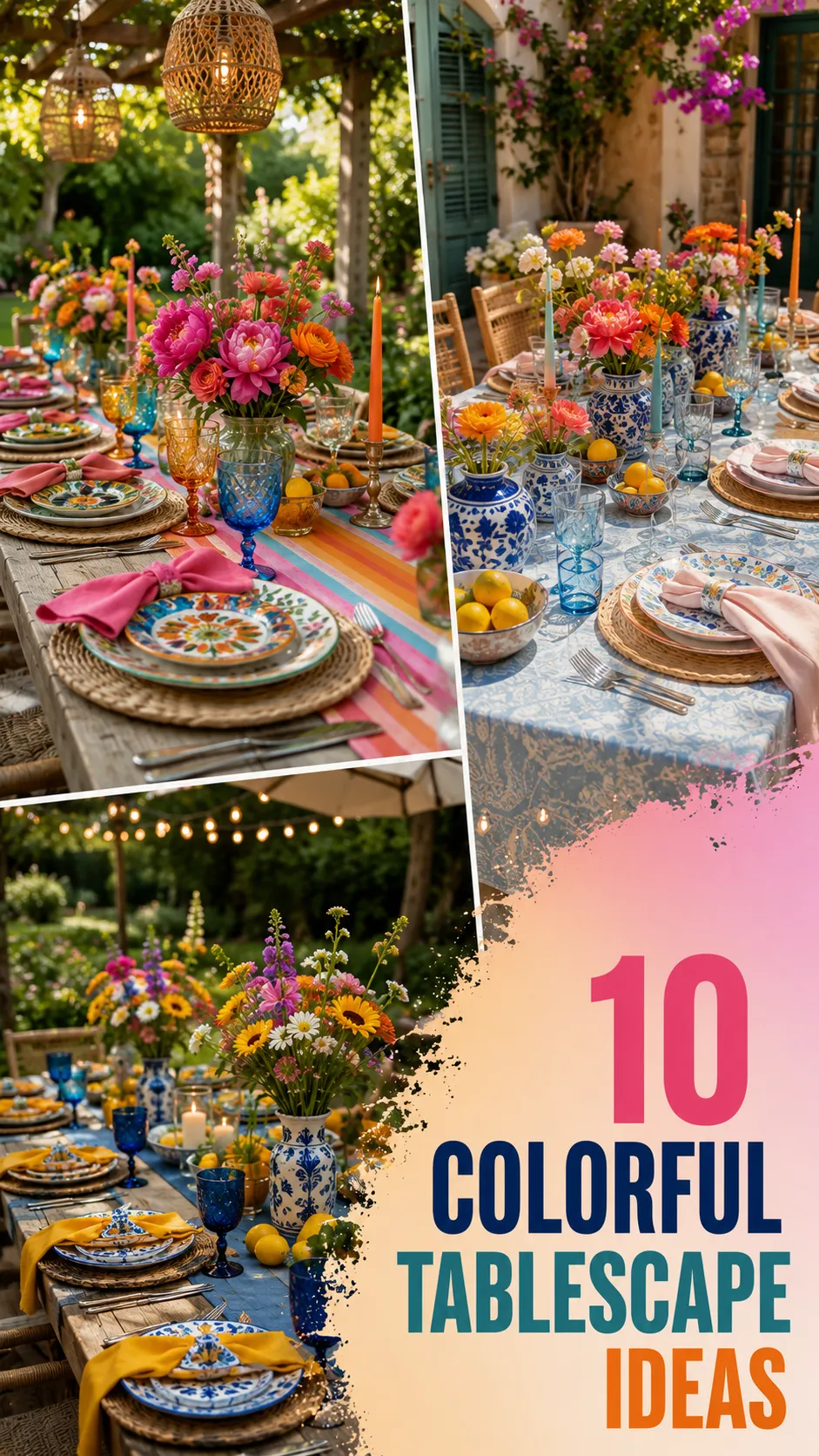
The dining table is the stage upon which the drama of a meal unfolds. While white linens and neutral stoneware have their place in the lexicon of design, there is an undeniable, infectious energy that arrives with the introduction of color. A colorful tablescape does more than just serve as a backdrop for food; it sets a mood, invites conversation, and signals to your guests that they are in for an experience that is intentional, vibrant, and alive.
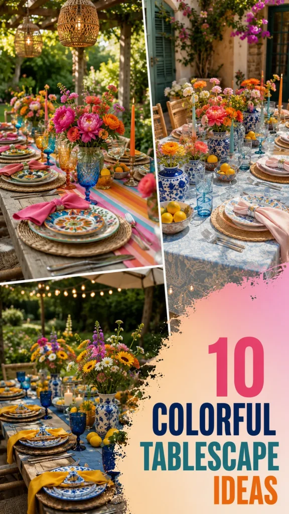
Color is a psychological tool. A cool-toned table can feel refreshing and calm, while a warm-toned table invites exuberance and appetite. Mastering the colorful table is about finding the balance between vibrancy and cohesion. Whether you are hosting a festive brunch, a summer garden dinner, or a sophisticated evening soiree, these ten colorful tablescape ideas will show you how to layer hue, texture, and light to create a table that stays with your guests long after the final course is cleared.
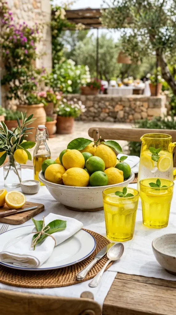
1. The “Citrus Burst” Palette
There is no better way to signal summer than with the sharp, zestful energy of yellow and lime.
- The Concept: Use a foundation of white or soft pale-yellow linens. Incorporate centerpieces of stacked lemons, limes, and grapefruits. Use glassware in vibrant, translucent yellow.
- The Vibe: Energetic, clean, and refreshing. This look is perfect for daytime events where you want the atmosphere to feel light and unburdened.
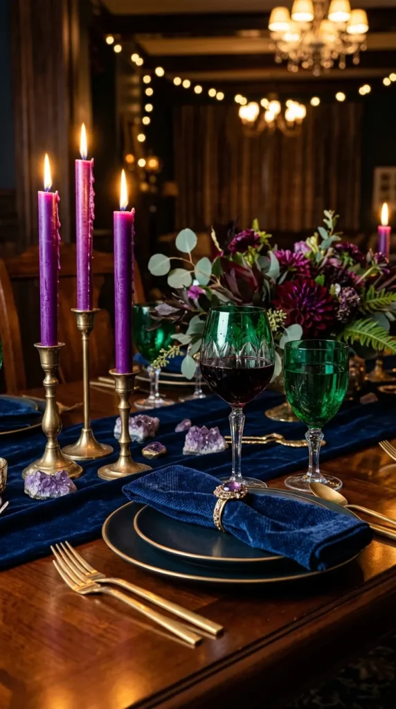
2. The “Jewel-Tone” Velvet Soirée
Jewel tones bring a sense of luxury and depth that lighter palettes cannot achieve. This is an ideal look for evening dinners or autumn gatherings.
- The Concept: Mix deep amethyst, emerald green, and sapphire blue. Use velvet napkins and glassware in saturated, jewel-toned glass. Incorporate gold-finished flatware to catch the candlelight.
- The Vibe: Opulent, intimate, and sophisticated. It feels like a private club experience right in your own dining room.
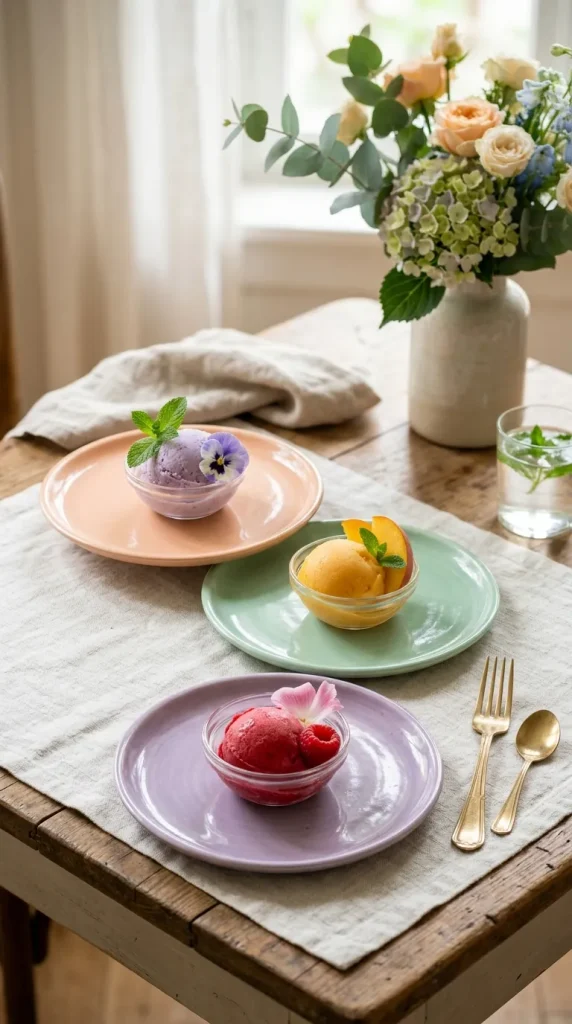
3. The “Sorbet” Pastel Gradient
For a table that feels light, feminine, and ethereal, look to the soft, dusty colors of a sunset or a bowl of sorbet.
- The Concept: Layer pale peach, mint, lavender, and baby blue. Use mismatched ceramic plates in these varying shades. Keep the centerpiece airy with light, feathery florals like sweet peas or baby’s breath.
- The Vibe: Dreamy, romantic, and whimsical. It is the perfect aesthetic for showers, garden parties, or spring celebrations.
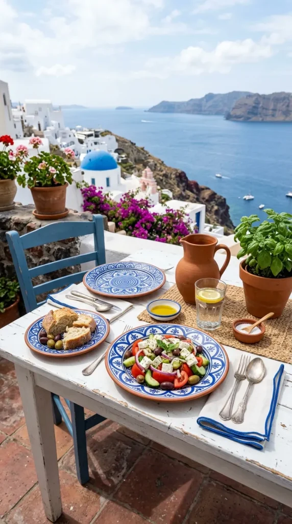
4. The “Mediterranean Cobalt” Contrast
The classic pairing of stark white and deep, saturated cobalt blue is a timeless design language that evokes the Greek Isles.
- The Concept: Use a crisp white tablecloth as your canvas. Incorporate bold, cobalt-blue patterned plates or hand-painted ceramic bowls. Add pops of terracotta to ground the color.
- The Vibe: Mediterranean, crisp, and timeless. It feels like a vacation in every sense of the word.
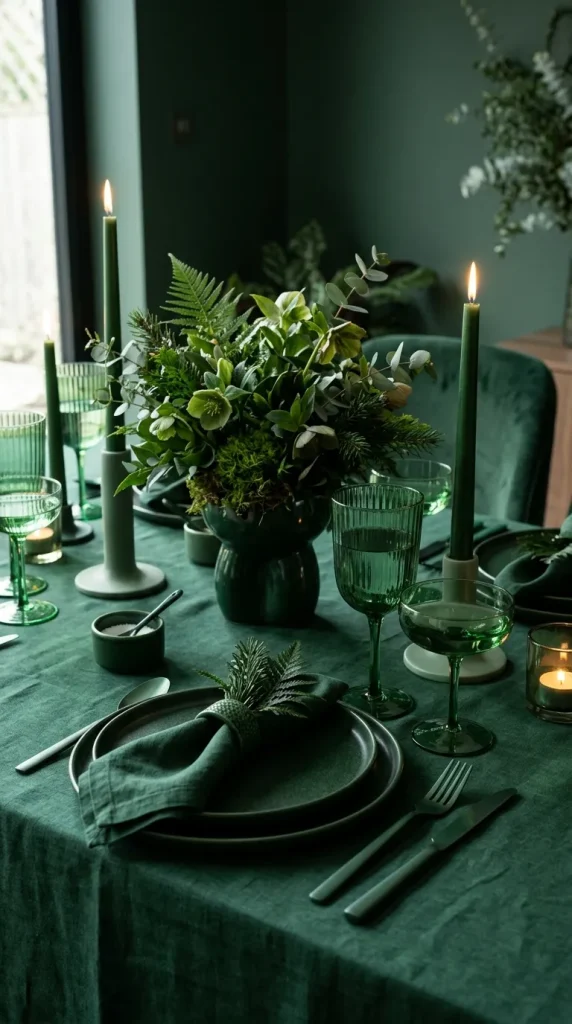
5. The “Monochromatic Power” Set
Sometimes the most effective way to use color is to commit to one, and only one, in all its various shades and textures.
- The Concept: Choose a single hue—let’s say, forest green. Use dark green tablecloths, light green glass goblets, olive-toned napkins, and emerald-hued candles.
- The Vibe: Bold, modern, and high-fashion. Monochromatic styling forces the eye to focus on the textures and materials rather than the distraction of multi-color clashes.
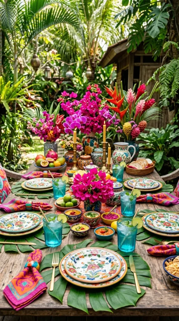
6. The “Tropical Maximalist” Array
When you want to throw a party that feels like a festival, look to the tropics.
- The Concept: Use a base of deep jungle-green. Layer in fuchsia, bright orange, and electric turquoise through floral arrangements (think orchids or birds of paradise) and patterned runners.
- The Vibe: Playful, loud, and immersive. This is the ultimate “vacation-at-home” setup, designed to maximize joy.
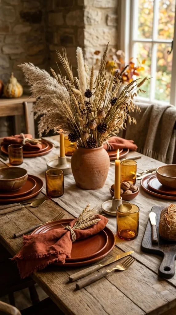
7. The “Warm Earth” Palette
Color does not have to be neon to be effective. A table built on the deep, saturated tones of the earth is incredibly inviting and comforting.
- The Concept: Use rust, ochre, chocolate brown, and burnt orange. Utilize natural materials—stoneware in earthy glazes, linen napkins in terracotta, and centerpieces made of dried grasses and gourds.
- The Vibe: Grounded, rustic, and incredibly cozy. This palette works beautifully for harvest dinners and winter gatherings.
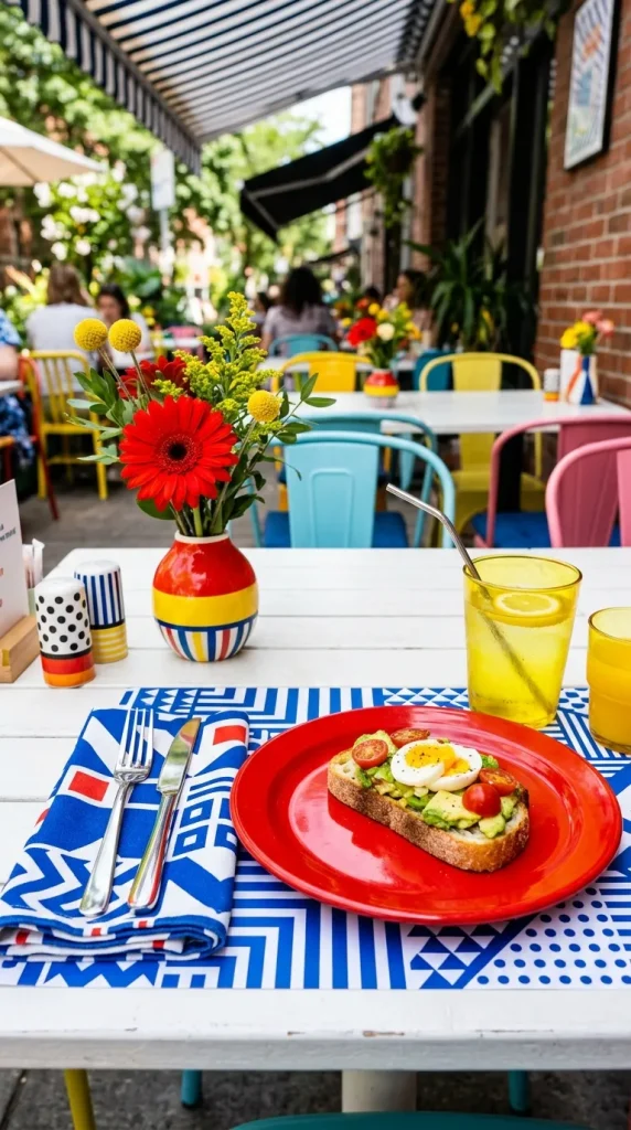
8. The “Pop-Art” Primary Mix
For a fun, youthful event, lean into the bold, uncompromising nature of primary colors: red, yellow, and blue.
- The Concept: Keep the walls and floor neutral, and let the table explode. Use bright red plates, yellow glassware, and blue-and-white striped napkins. Keep the lines clean and the shapes geometric.
- The Vibe: Retro, graphic, and fun. It feels like an art-gallery installation that doubles as a dining space.
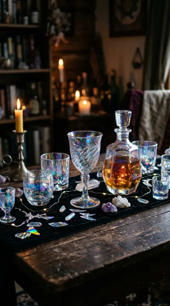
9. The “Opalescent” Iridescent Table
Create a table that changes color depending on the angle of the light.
- The Concept: Use iridescent glassware, holographic place card holders, and mother-of-pearl accents. Pair these with white or translucent materials to let the light play the lead role.
- The Vibe: Futuristic, magical, and ethereal. This is a stunning choice for nighttime events where candlelight will cause the surfaces to shimmer.
10. The “Sunset Gradient” Ombré
Create a color story that mimics the transition of the sky at dusk.
- The Concept: Arrange the table setting to shift from deep purple at one end, through magenta and orange, to a pale yellow at the other end. Use napkins, glassware, and even the candles to execute this shift.
- The Vibe: Immersive, artistic, and breathtaking. It turns the dining table into a singular, cohesive piece of performance art.

Masterclass: How to Layer Color Without the Clutter
To prevent a colorful table from becoming a chaotic one, follow these three rules:
- The “60-30-10” Rule: Use a base color for 60% of the table (like the tablecloth), a secondary color for 30% (plates and runners), and an accent “pop” color for 10% (napkins, candles, flowers).
- Texture is a Color: If you are afraid to add more color, add more texture. A rough terracotta bowl feels different than a smooth glass one, even if they are in the same color family.
- Mind the Lighting: Colors look different under artificial light than they do under sunlight. If you are hosting at night, opt for slightly warmer, deeper shades of your chosen colors, as they will look richer in the golden glow of candles.



Leave a Reply